 |
  |
|
|
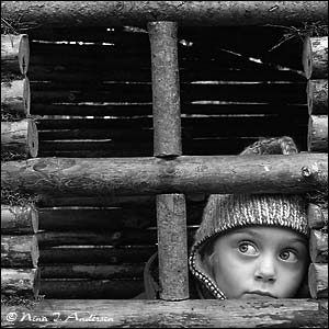
There are so many ways to convert a color picture into black & white, and here I'll show you a few ways to do this.
|
|
Ok - here we go. Start
with opening up your picture. I'll start with showing you the 2 easiest ways of converting to b&w - and by some the most common methods: Grayscale and Desaturation. I rarely use these 2 methods though because they usually produce a flat image with low contrast. Let me show you: |
|
|
|
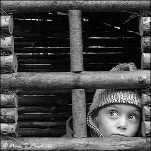
Grayscale Image - Mode - Grayscale Simple as that - but as you can see it loose some dept. Didn't turn out really bad on this particular image though... |
|
|
|
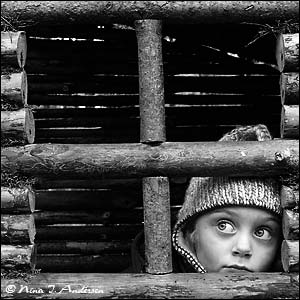
Desaturate Image - Adjustments - Desaturate Quick and easy - but the image has very low contrast, and it appears "pale" and flat. Not what I had in mind at all. What I really love about old fashion B&W photography is the great dept and contrast they can provide. Ok
- it's time to get serious; |
|
 |
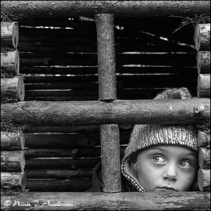
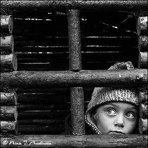
Hue/Saturation Adjustment layer The
next method I'm gonna show is by simply using several Hue/saturation
adjustment layers. At your original picture layer go to Layer - New Adjustment layer - Hue/Saturation. Then just click OK without altering any of the settings - and then change the layer mode from Normal to Color. Then add a new Hue/Saturation Adjustment layer - but this time turn down the Saturation to -100 before you click OK. You can see how my picture looked like so far in the picture to the left. |
|
 |
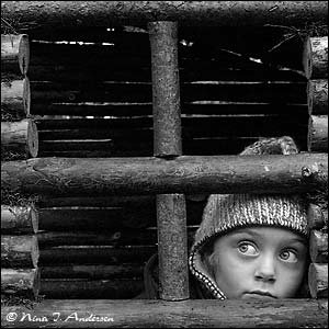
Now
the fun begins. Here's the settings I used to get the effect on the picture to the left. It's starting to look good - but I still think it lacks a little something... |
|
|
|
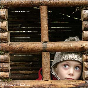
Here's what we'll do: Duplicate
the Hue/Saturation Adjustment layer (still the color mode one) by
dragging it down to the Create New Layer tab Now change the layer mode on this new adjustment layer from Color to Overlay, and then drag down the opacity a little. I took mine down to 64% opacity. Now we're getting somewhere! You see my end result here to the left. The contrast is great without loosing any detail - which again really adds depth to the picture. This is what I had in my mind when I started out. Note that different pictures will need different treatment to get the results you want - so be sure to play around with other settings and layer modes as well :)
|
|
 |
Channel Mixer The final method I'm gonna show you is by using Channel Mixer Adjustment layers. On the picture layer go to Layer - New Adjustment Layer - Channel mixer. Now be sure to check the Monochrome option like shown here. Now
adjust the effect on your picture simply by sliding the red, green
and blue channel sliders. I set the red and green channel to zero and the blue channel to 100. This gives a very drastic effect to the skin tones - but for this picture I think it fitted really well. |
|
|
Final step. Duplicate
the Channel Mixer Adjustment layer by dragging it down to the Create
a New Layer tab. The picture on the left shows how my picture looks after adding the last Channel Mixer Adjustment layer. It's a bit dark and moody - but that really suits this particular picture. Ok
- we're done!
|
|
Only permitted Images and Material may be downloaded from this web site.