 |
  |
|
|
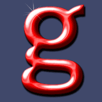 Figure 1 |
Pretty neat text effect don't you
think? |
|
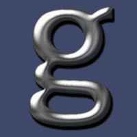 Figure 2 |
Figure 2: This is how our image look before we add the hue/saturation adjustment layer. Now be sure you are on the text layer
and go to Layer - New - Adjustment Layer - Hue/Saturation, and be
sure to check the Group With Previous Layer option.
|
|
 Figure 3 |
Now it's
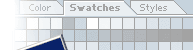
time for that final detail. Make a new layer - make sure it's on top of all the layers. Select the Paintbrush Tool Go to the brushes palette and select a brush similar to mine. Make white your foreground color, and in the Paintbrush options window make sure the mode is set to Normal - Opacity 100%. Now place the brush on you image where you think it's nice to add some spark and left-click a couple of times. Ta da ! Your image should now look like fig. 1 :=)
|
|
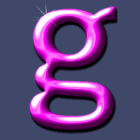 Figure 4 |
Want to give
the text another color? Make a duplicate of your image and close the "old" one. Now select the text layer and hit Ctrl+E to merge the text layer and the adjustment layer. (The effect looks best this way...). Still at the text layer select Layer - New - Adjustment Layer - Hue/Saturation - and check the Group With Previous Layer box. Play around with the settings until
you get the desired color. For this image I used:
|
|
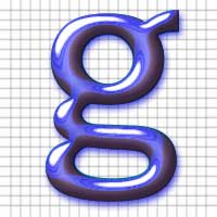 Figure 5 |
OK - final
example! I just love this aqua-effect :o) To make this effect I first finished
the whole Chrome text tutorial. That means I added some hue/saturation
after I made both the adjustment curves layers! Then add some drop shadow to the text layer with a nice blue color. Pretty cool huh? |
|
Only permitted Images and Material may be downloaded from this web site.